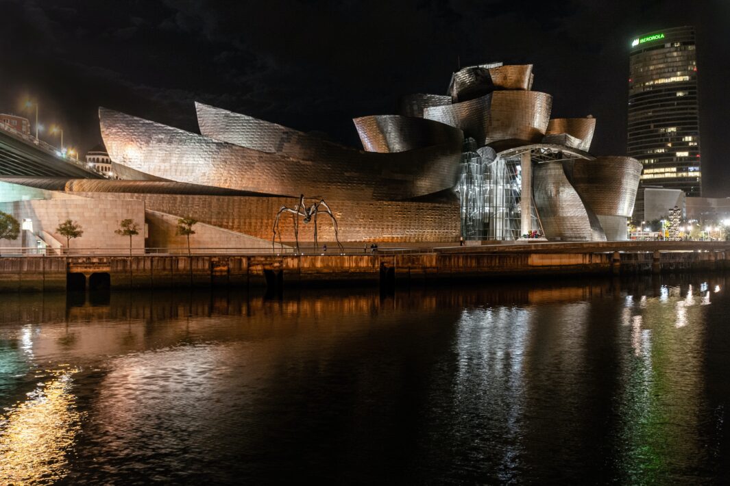
“The architectural reincarnation of Marilyn Monroe”, an intergalactic ship, a blossoming rose, an artichoke and even a superman – these are just some of the associations that the Guggenheim Museum in Bilbao evokes among architectural critics. This flight of fancy is largely inspired by the features of the Deconstructivism style: deliberately complex formal language, architectural forms that constantly intersect, and intricately curved surfaces. What image did the author of the project, Frank Gehry, actually take as a basis? Why would an architect need software designed for the aerospace industry? What is the “Bilbao effect”? And how did Frank Gehry change the attitude of customers towards wow-effects in architecture? Let’s find it out!
Frank Gehry – one of the brightest adherents of the deconstructivism style – has always created buildings that leave no one indifferent. Moreover, opinions about his buildings can simultaneously be the most enthusiastic and sharply condemning. The Guggenheim Museum in Bilbao is a prime example of this. Even Gehry himself admitted that at the opening of the museum he had a thought: “God! What have I done?!” And as a result, the Guggenheim Museum designed by him turned the industrial city of Bilbao into one of the cultural centers of the world.
The building is located on the embankment of the Nervion River. Previously, there was a port for merchant ships. But in the early 1990s, the city hall decided to breathe new life into this decrepit and noticeably dilapidated district of Bilbao. It was the history of the site where the Guggenheim Museum was built that inspired the architect to create the concept of the project. Frank Gehry said that the project is based on the image of a wrecked ship, which is reassembled. Actually, this approach to shaping is the basis of deconstructivism.
The Guggenheim Museum in Bilbao is a combination of many architectural volumes of different sizes and shapes. The overall composition of the building is built around a central atrium 55 meters high. The interior spaces are heterogeneous and, along with ten rectangular halls, there are rooms of the most unexpected shapes.

Due to the mathematical complexity of the design, Frank Gehry decided to work with advanced software, CATIA, originally created for the aerospace industry, in order to implement his concept as accurately as possible. For the outer shell of the building, the architect chose 33,000 extremely thin titanium sheets. Each of them is designed as a reflector of light. The surface of the building abounds with different color shades, reacting to the waves of the Nervión River, sunlight and the movement of clouds. Complex mathematical calculations were also needed. It was done so the Frank Gehry Guggenheim Museum would not repeat the fate of his other project – the Walt Disney Concert Hall in Los Angeles. Its facade, reflects the sun’s rays, and it heats the street and nearby buildings to very high temperatures. Two other materials used in construction are limestone and glass.
The Guggenheim Museum Bilbao covers an area of 24,000 square meters, of which 11,000 are reserved for exhibition halls. In addition to the gallery space, there are offices, a 300-seat auditorium, shops, a cafeteria and two restaurants.
Since its opening, the Guggenheim Museum Bilbao has welcomed nearly one million visitors a year. Thanks to the original architecture, the building has become a real hallmark of the city. It attracts many tourists from all over the world to Bilbao. Thinking about this effect, the researchers even introduced the term “Bilbao effect”. This effect characterizes the phenomenon of the rapid growth in popularity of a place that was not previously known, due to the introduction of the wow-effect into the architectural context.
There is an assumption that it is the “Bilbao effect” that explains the boom in the original architecture in the United Arab Emirates, where the wow-effect has become almost an obligatory component of the project. This is indirectly confirmed by the fact that the Guggenheim Museum in Abu Dhabi was also designed by Frank Gehry himself.
The Guggenheim Museum in Bilbao is designed without right angles, all rooms smoothly flow from one to another. The total internal area is 24 thousand square meters. m, almost half of which is occupied by exhibition spaces, divided into 19 galleries.
Moreover, 10 halls have a classic rectangular shape and stone finish, and 9 other rooms with titanium shells amaze with unusual broken lines and shapes of walls, ceiling and even floor.
The main hall of the atrium has a curved volume with huge glass windows, filled with light inside. From the huge central hall, multi-level halls diverge into 3 floors, which mysteriously flow from one to another. The floors can be reached by a glass elevator or spiral staircases. going up to the ceiling at a height of 55 meters.
There are also classical exhibitions of generally recognized brilliant masters. Visitors could see Michelangelo’s pencil drawings, Durer’s engravings and unusual musical instruments. You can also find a rare piano with unusual American made piano accessories.
In addition to artworks by popular avant-garde artists, the museum center uses modern fundamentally new ways of presenting materials. There are many installations, electronic panels, video art, interactive exhibitions. Electronic and digital works are shocking with the unlimited possibility of visual effects provided by scientific and technological progress.